Busha Business: Indexes
Building a financial product builder
How a failed payments product became a platform for asset managers to build, price, rebalance and distribute their own crypto index funds.
FintechCryptoProduct Design
Listen to this case study, about 14 min
A note on scope
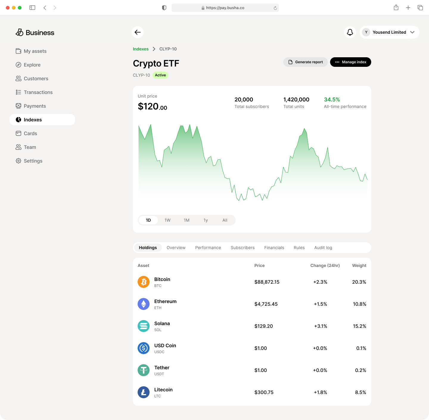
Indexes is one surface of Busha Business, the company’s B2B platform. I worked across that platform, including payments, invoicing and account connection in settings. I’m writing up Indexes because it holds the clearest design problem, not because it was all I did.
The product has moved on since I left, so what’s running today differs in places from the screens below. These are the designs as they stood when I built them.
It started with something that failed
Busha Commerce was the company’s first attempt at serving businesses: an API that let them accept crypto payments from their customers. It failed, and not in the way a feature underperforms. It was a company-wide bet that came back with an answer nobody wanted. Businesses weren’t asking to accept crypto.
A failure that size leaves you with something useful, though: a list of people who tried your product and stopped. We kept talking to them over the following years, not to sell them Commerce again, but to find out what they’d been trying to do when they signed up.
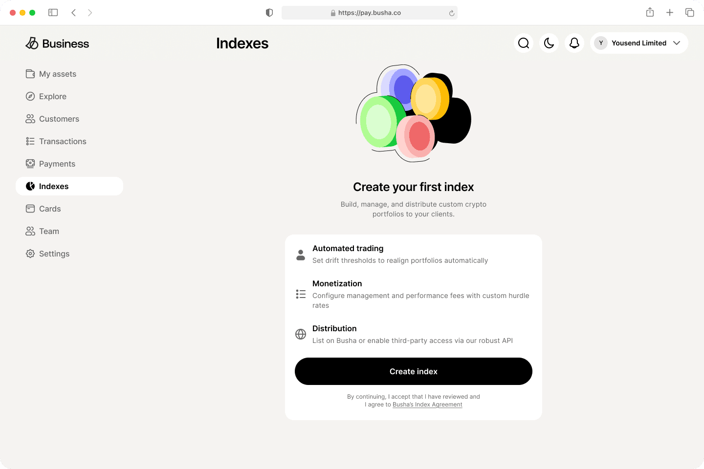
Indexes came out of those conversations. The businesses we spoke to weren’t looking for a new way to get paid. They wanted to package what they already knew about crypto into something they could sell to their own customers.
That’s a different product entirely. Commerce treated a business as someone who receives money. Indexes treats it as someone who runs a financial product, with its own subscribers, fee structure, rebalancing policy and regulatory surface.
Who it is for
Asset managers. Small funds and crypto-native investment firms with a thesis about which assets belong together, who want to sell exposure to that thesis without building the infrastructure underneath it.
Before Indexes, packaging a basket meant building custody, rebalancing, subscription accounting and fee collection yourself. Most firms just didn’t bother.
The user knows finance and doesn’t necessarily know software. That combination shaped almost everything below. I could assume they knew what a high-water mark was. I couldn’t assume they’d forgive an interface that let them ship a broken product to real subscribers.
The problem
Running an index fund isn’t one decision. At creation it’s roughly forty: asset selection, weighting, rebalancing policy, four separate fee mechanisms, distribution rights, regulatory disclosure. Then it’s a continuous stream of them afterwards, every time the market moves the portfolio away from its own stated weights.
The design problem wasn’t making this easy. It was making it hard to get wrong without making it feel hard.
Constraints
Regulatory. Busha operates under a Nigerian SEC licence, and the SEC shaped several of the choices below. The key information document is a required upload. Risk level is a mandatory declaration with defined tiers, not free text. And whoever makes an index can’t publish it themselves, which is why the last action in the creation flow reads Submit for verification. Verification was an automated check, not a human review, but the distinction mattered in the interface: the manager needed to know that pressing the button started something rather than finished it.
Team size. One designer, one PM, three engineers. Everything below had to be buildable by three people in a quarter.
No users yet. We were designing for a closed beta, with no behavioural data to lean on and no established local pattern to copy. Decisions got argued from first principles or from the interview record.
Creating an index
Five steps, and a review that acts as a gate
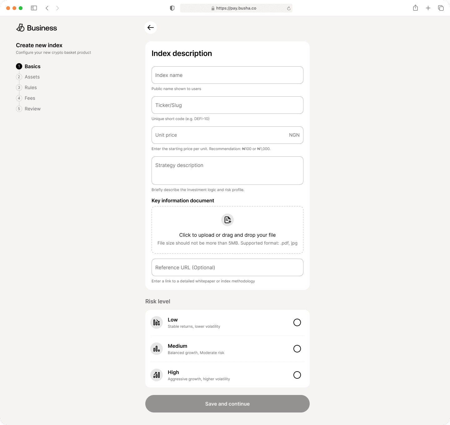
The flow is Basics, Assets, Rules, Fees, Review. Each step is one conceptual decision instead of a pile of fields, and any step can be saved as a Draft and returned to. That matters at step four, where someone commits to a fee structure they may want to discuss with a partner first.
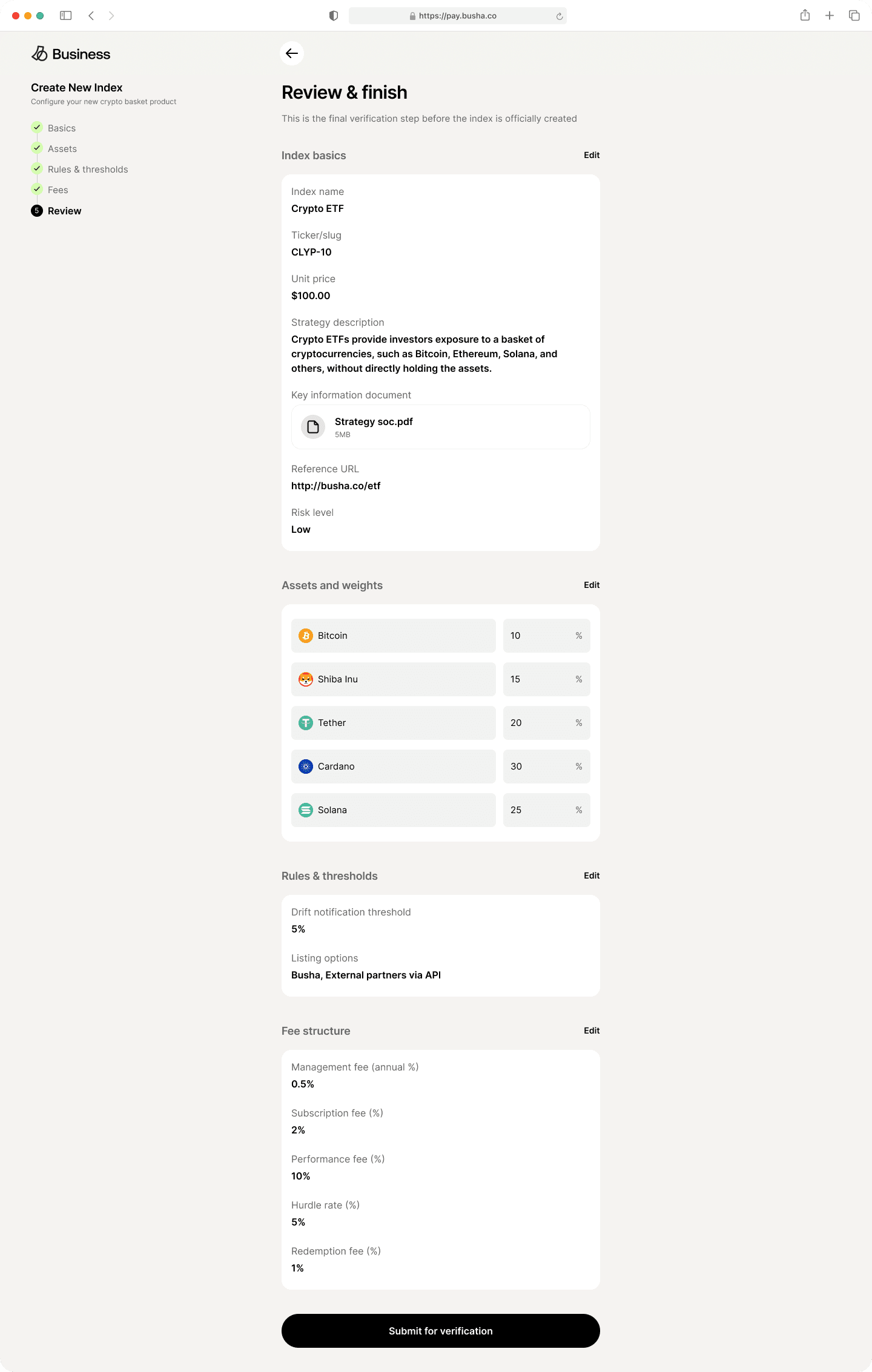
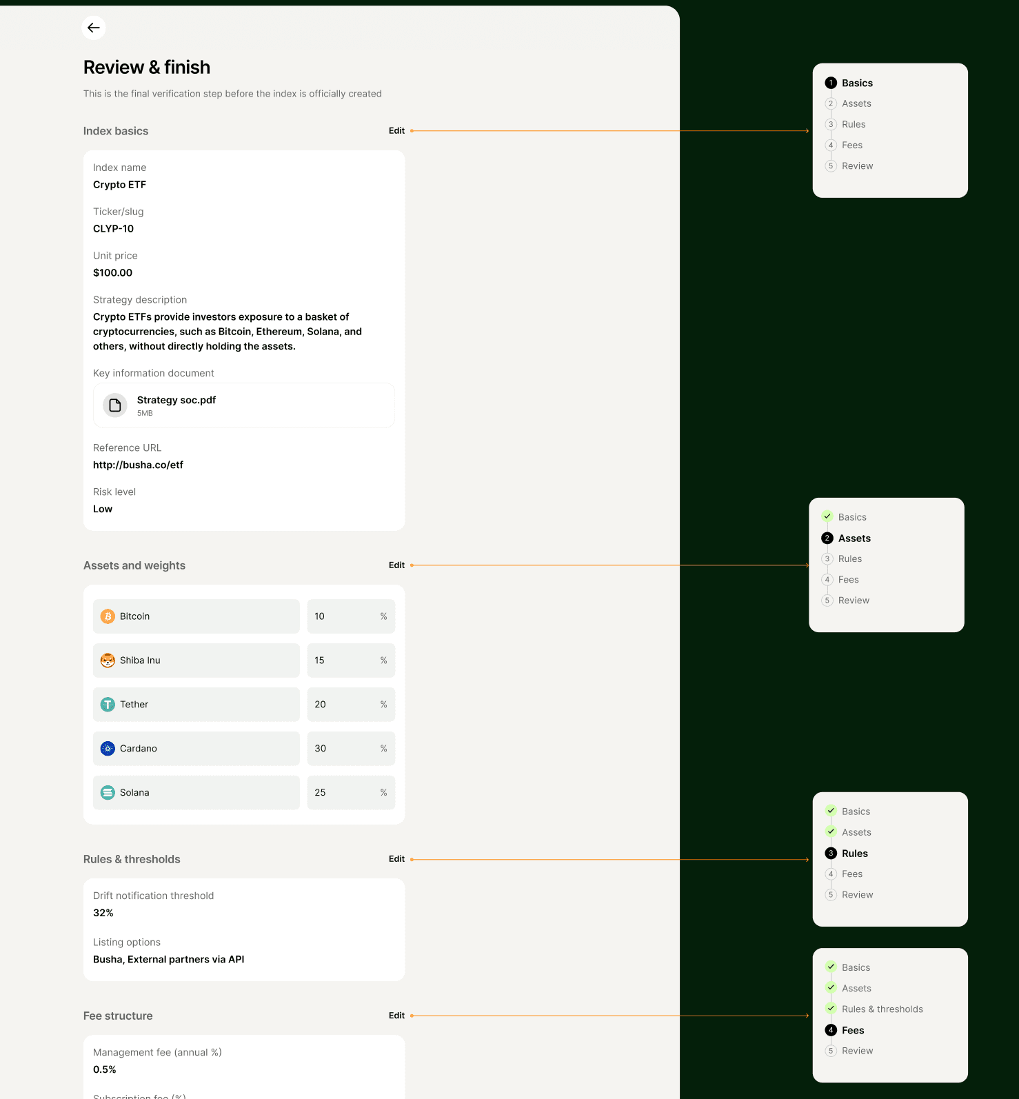
The Review screen is the one I’d defend hardest. It isn’t a summary. Each section on it, index basics, assets and weights, rules and thresholds, fee structure, carries its own Edit link back to that specific step instead of to the start of the flow. The final button reads Submit for verification.
That wording does real work. Most wizards end with a button implying the thing is done. Here it isn’t, because a human still has to approve it, and springing that on someone at the last moment would be a bad surprise on a regulated product.
Two kinds of wrong, two places to say so
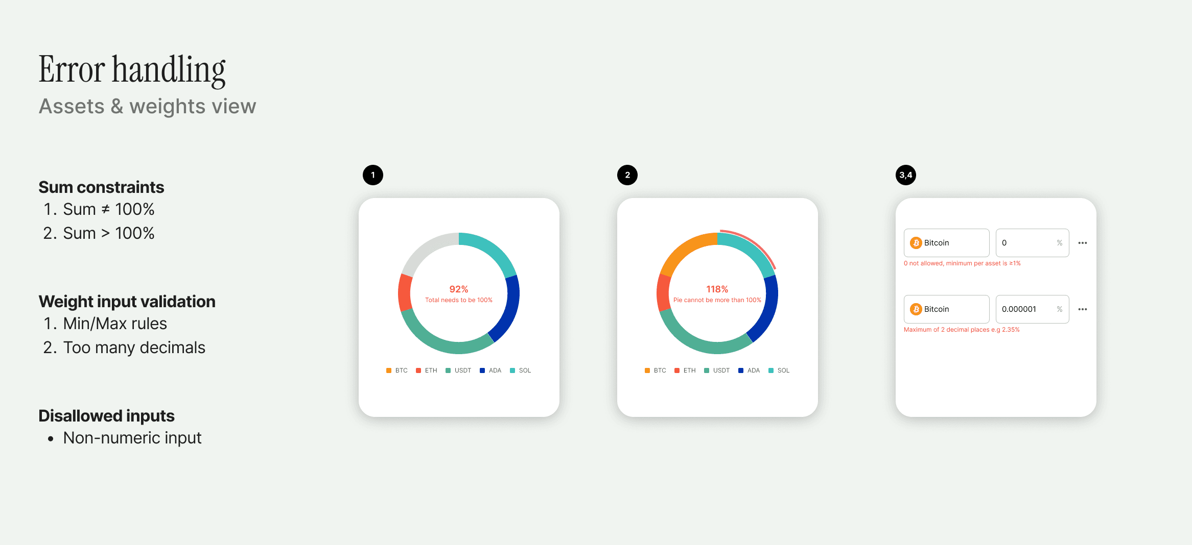
The weights step has more failure modes than it looks like it does. I mapped five: the total falls short of 100%, the total exceeds it, an individual weight sits outside the allowed range, a weight carries too many decimal places, and the input isn’t a number.
I stopped treating those as one problem. A weight of 0.000001 is wrong on its own terms, without reference to anything else on the screen. A total of 92% isn’t wrong about any particular field. It’s wrong about the relationship between all of them.
So per-field problems get per-field messages, directly under the input. Minimum per asset is 1%. Maximum two decimal places. Those are rules about a number, and they belong next to the number.
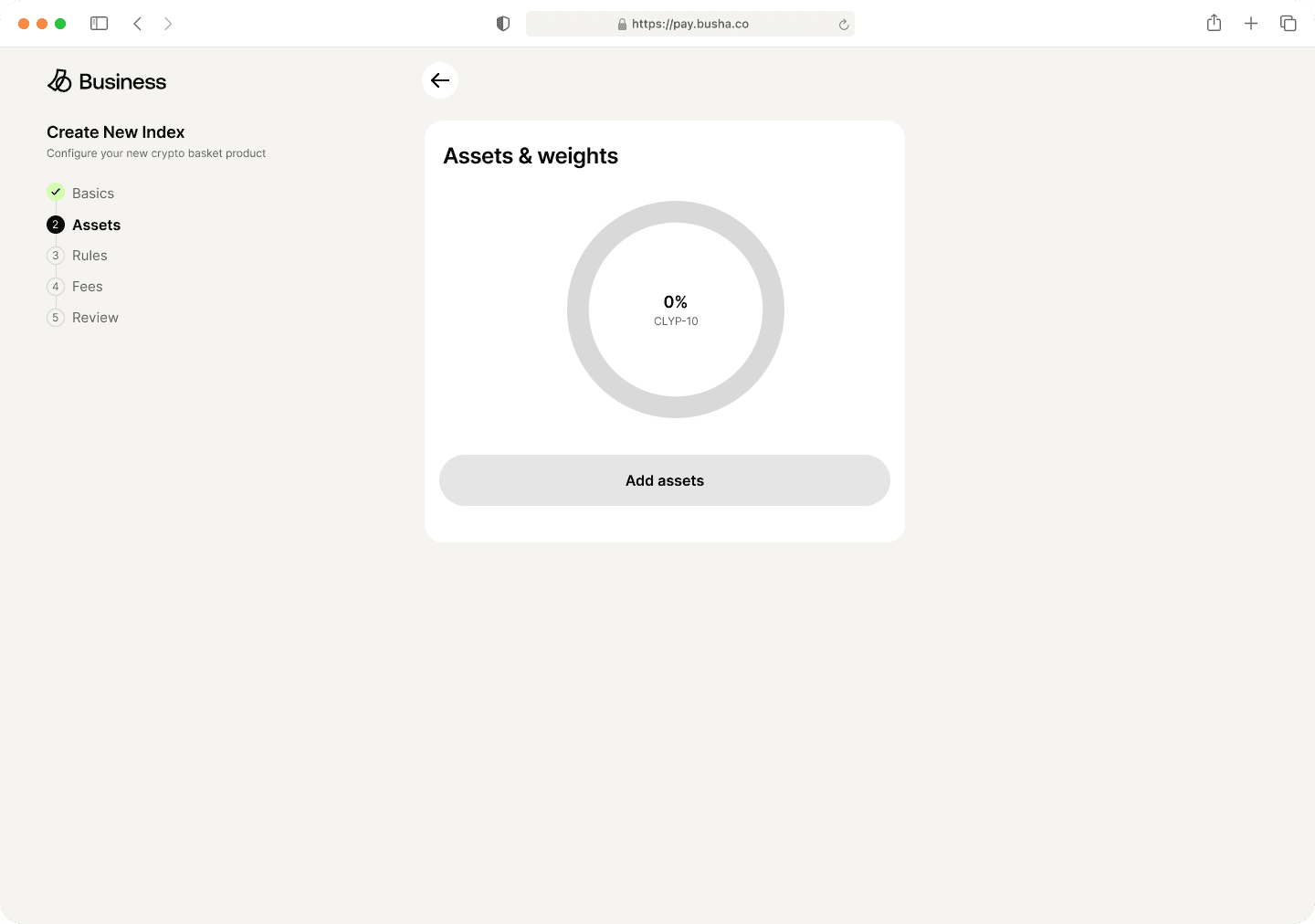
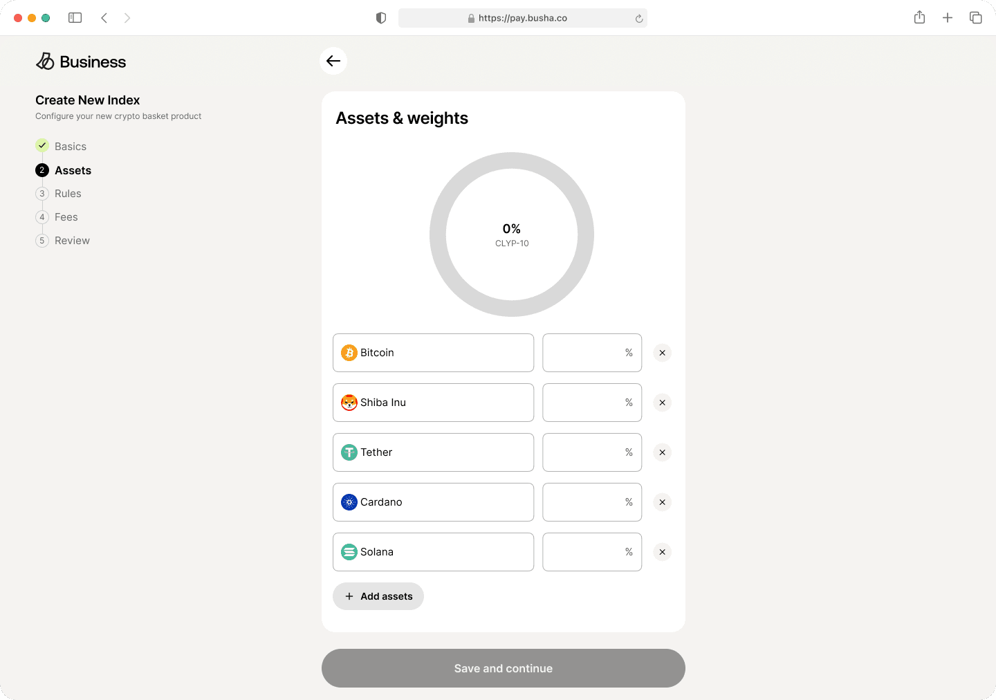
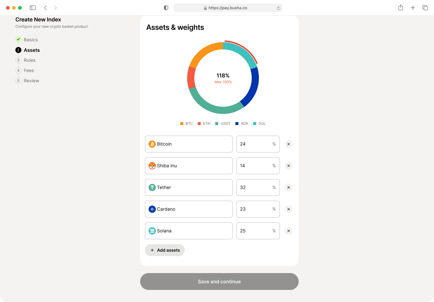
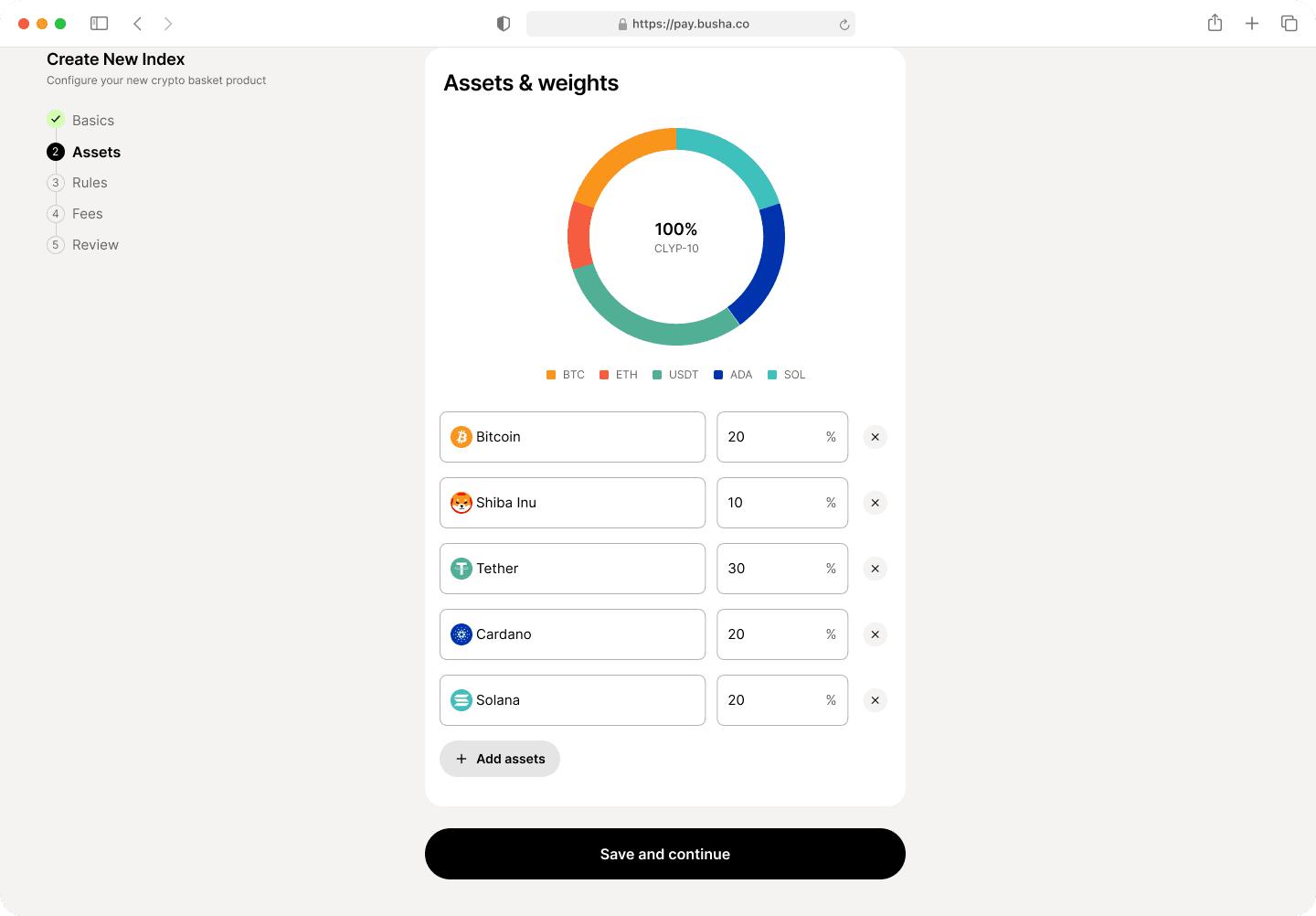
The aggregate constraint went into the donut. The ring is there from the moment the step opens, sitting at 0% and grey. It fills as allocations are entered. Short of the target, the shortfall stays grey and the centre reads 92%, total needs to be 100%. Over the target, the excess renders as a red arc breaking outside the ring, and the centre reads 118%. At exactly 100% the centre switches to the index ticker and the ring closes.
My reasoning: an allocation is a shape before it’s a number. Someone splitting five assets across a portfolio thinks in proportions, so an error about proportions should live in the proportion. The two failures should also look different, because they are different. An incomplete allocation is unfinished work and an over-allocation is a contradiction. Grey space reads as something still to fill. A line breaking out of the ring reads as something that doesn’t fit.
I built the sum constraint as an inline message first and moved it. The message only spoke at the end. You could type five numbers, reach for the button, and only then learn the set was wrong, with no clue which number to change or by how much. The ring is always talking, so you correct during the work instead of after it.
Interactivethis one is live, not a screenshot
Assets & weights
0%CLYP-10
- BTC
- SHIB
- USDT
- ADA
- SOL
100% left to allocate
100% left to allocate
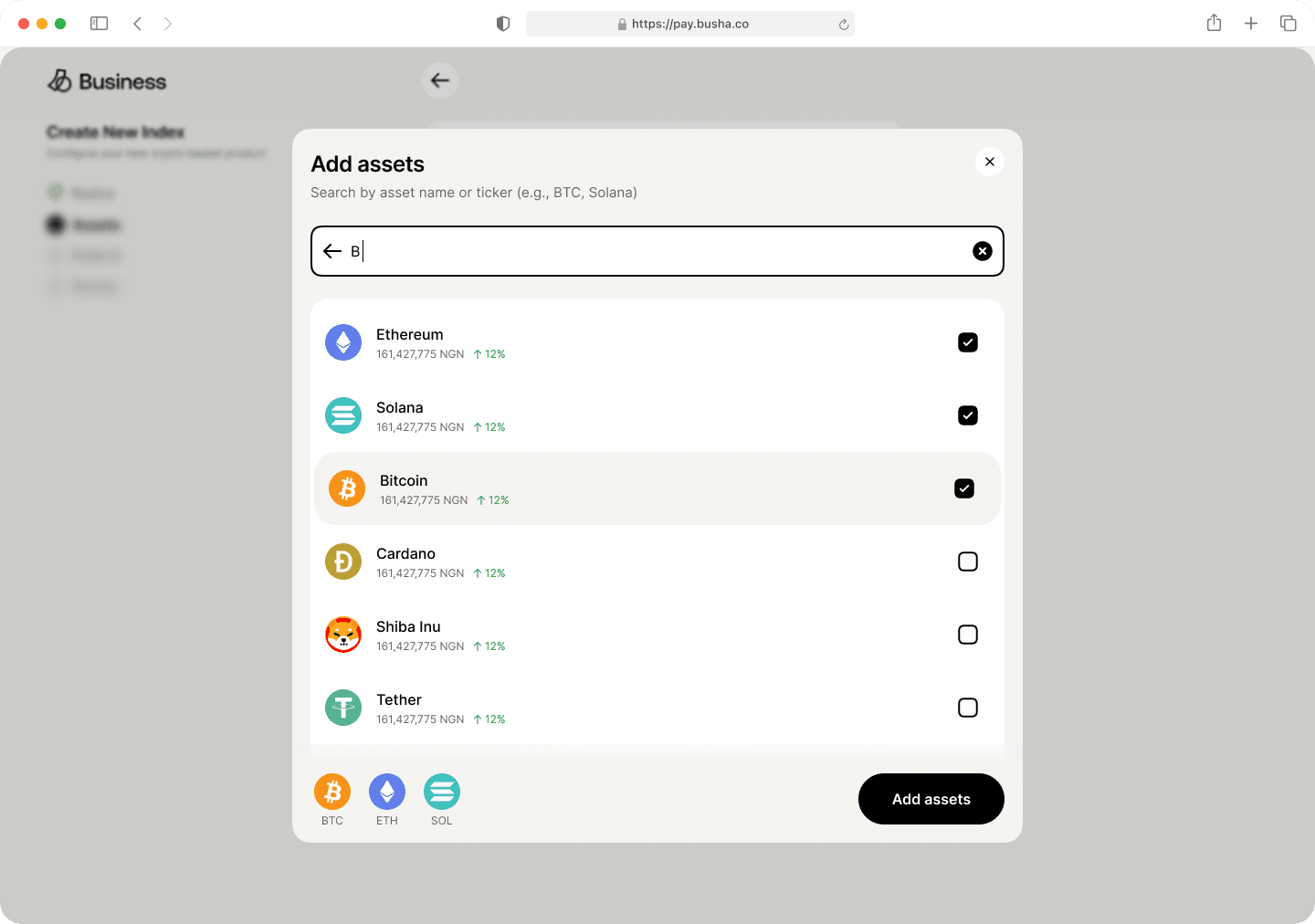
Type a percentage into any field and the ring fills as you go. Take an asset out and its weight returns to the pool instead of being spread across the others, because no number a manager chose should be rewritten for them. Push past 100 and the overage is reported rather than blocked. Enter 0 and it tells you why 0 is not allowed.
Fees that reveal themselves in sequence
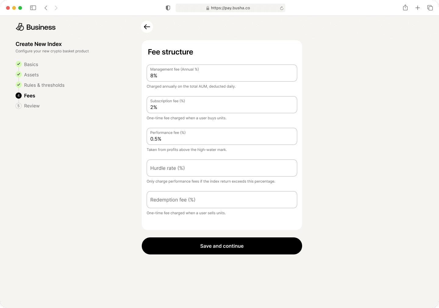
There are four fee mechanisms and they don’t work alike. Management fee is annual on AUM, deducted daily. Subscription fee is one-time on purchase. Redemption fee is one-time on sale. Performance fee comes out of profits above the high-water mark.
Performance fee has a dependency the others don’t: a hurdle rate, which only charges the fee if the index return clears a set percentage. Showing an empty hurdle rate field to someone who hasn’t set a performance fee is showing them a control for something that doesn’t exist yet.
So the hurdle rate appears once a performance fee is entered. The step has four fields for someone building a simple product and five for someone building a sophisticated one, and neither sees an option that doesn’t apply.
Every field carries a one-line explanation of what it means in practice. Sophisticated users still benefit from being told exactly how your platform reads a term they already know.
The Rules step is where the strategy hides
It holds two things that look like configuration and behave like strategy.
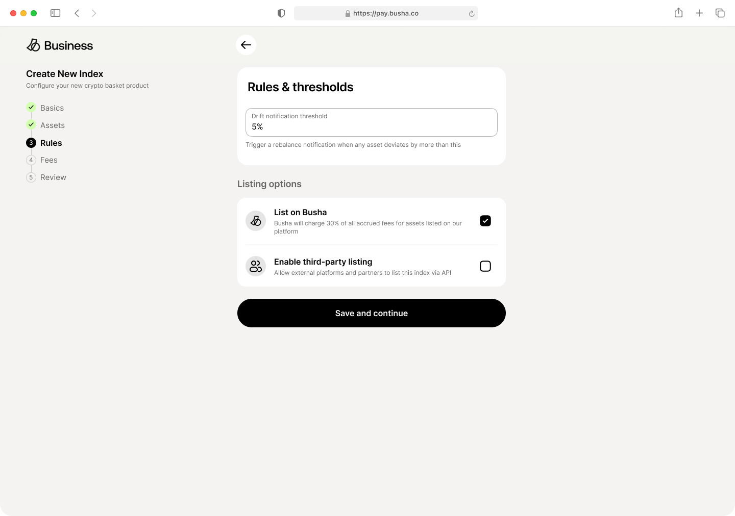
The drift notification threshold sets how far an asset can deviate from its target weight before the manager gets told to rebalance. It’s one number, and it’s the difference between a fund that tracks its own prospectus and one that quietly stops.
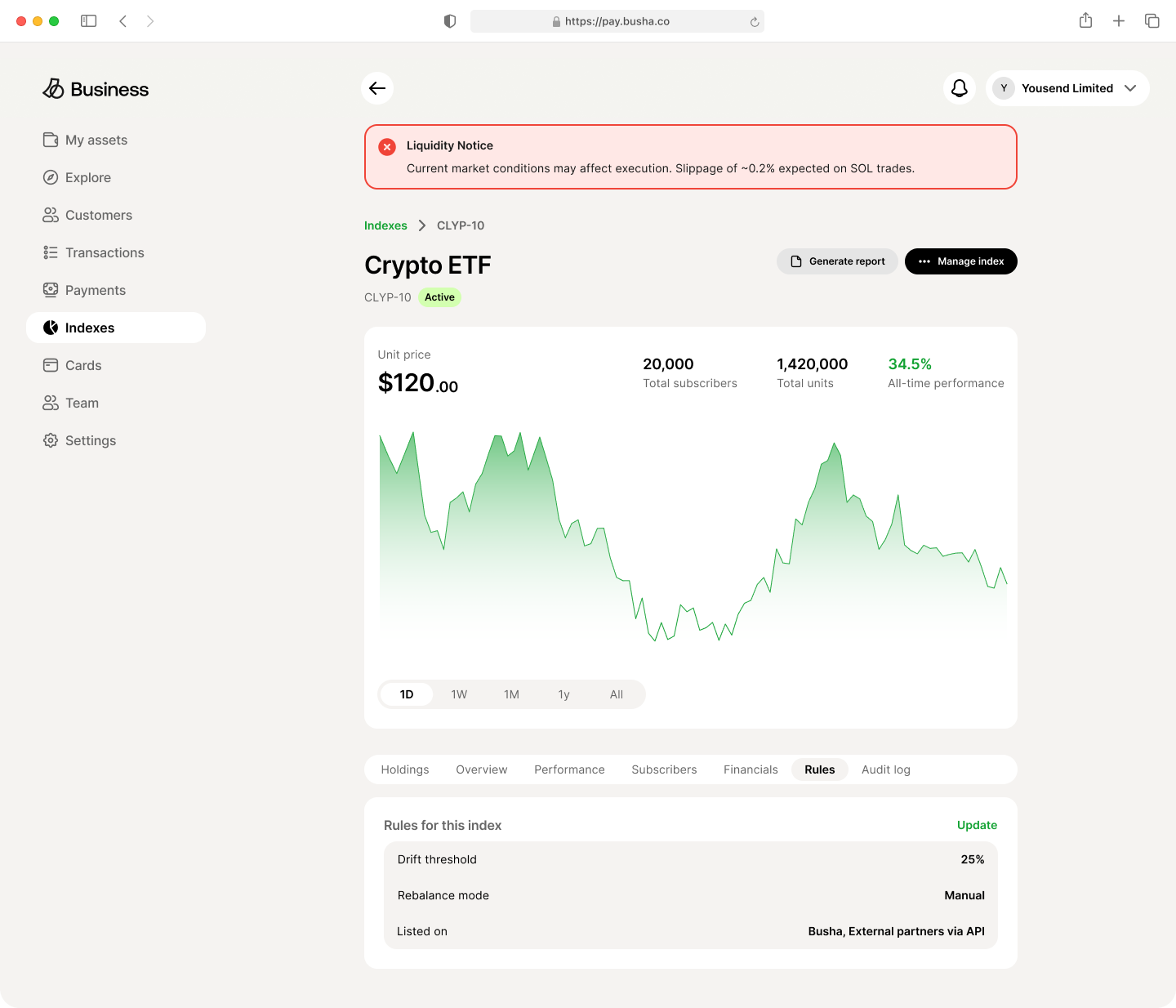
Listing options is the more interesting half. List on Busha is a checkbox stating plainly that Busha takes 30% of accrued fees on assets listed through the platform. Enable third-party listing opens distribution to external partners via API.
I put the revenue share in the option label instead of a terms document. A manager choosing a distribution channel is making a pricing decision, and the cost of that channel belongs at the point of the choice, not in a link they won’t open.
Running an index
Creating a fund is the easy half. The harder problem arrives every week afterwards, when the market has moved and the portfolio no longer matches what the manager promised their subscribers.
Let the manager choose how much control to give up
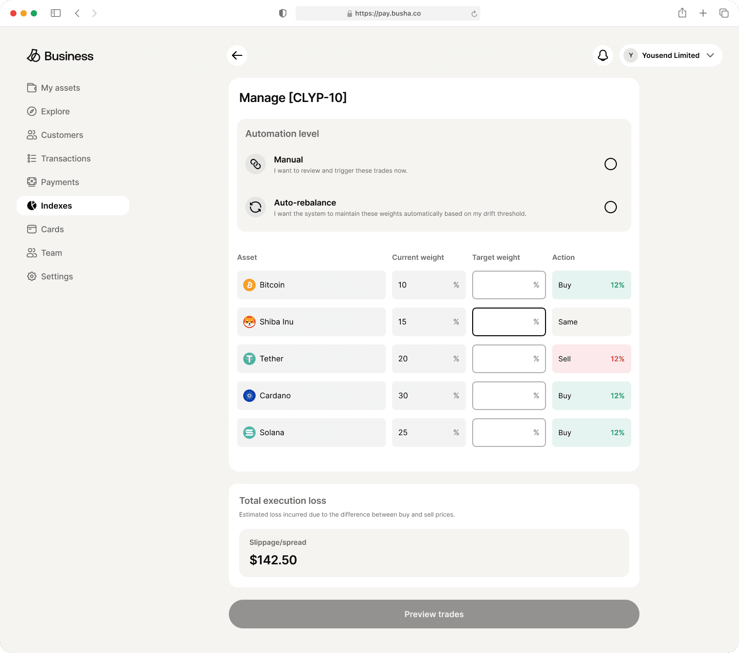
The Manage screen opens with a single choice. Manual, phrased as “I want to review and trigger these trades now”, or Auto-rebalance, phrased as “I want the system to maintain these weights automatically based on my drift threshold”.
I wrote both in the first person, as intentions instead of feature names. Automation here is a delegation of financial authority, and the language should make the user feel the weight of what they’re agreeing to. A manager who picks auto-rebalance is saying the system may trade their subscribers’ money without asking. That deserves a sentence, not a toggle.
The interface does the arithmetic
The rebalance table lists each asset with its current weight, an input for target weight, and an Action column. As targets are entered, the Action column resolves to Buy 12%, Sell 12% or Same, colour-coded green, red and neutral.
The manager doesn’t work out the delta. They set the intent and the interface tells them what that intent means in trades. That’s the gap between an interface that shows you numbers and one that answers the question you actually have, which is “what am I about to do”.
What a rebalance costs, before you commit to it
Below the table sits Total execution loss, explained as the estimated loss from the difference between buy and sell prices, with a slippage and spread figure attached.
Rebalancing isn’t free. The gap between the trade you intend and the trade you get is real money, and it comes out of subscribers’ returns. Putting that number on the same screen as the inputs, updating as the targets change, makes the cost part of the decision instead of something you discover later in a statement.
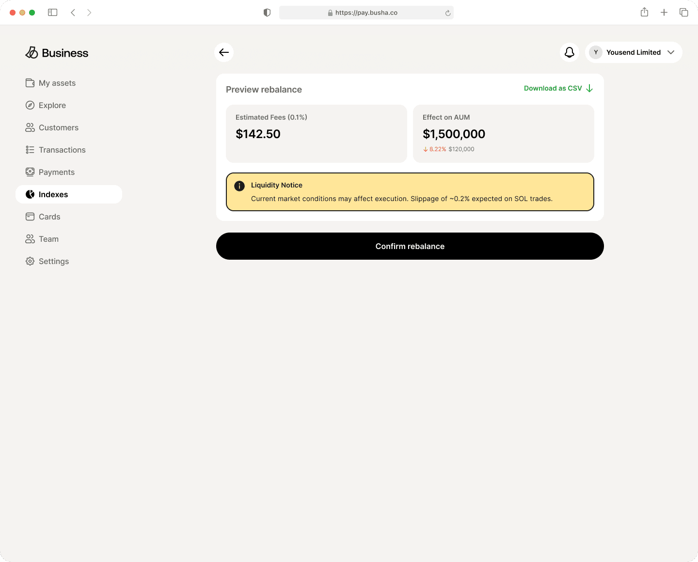
The Preview screen goes further with estimated fees and the effect on AUM as both a percentage and an absolute figure, plus a CSV export for anyone who needs to take the numbers elsewhere.
Two people, one trade
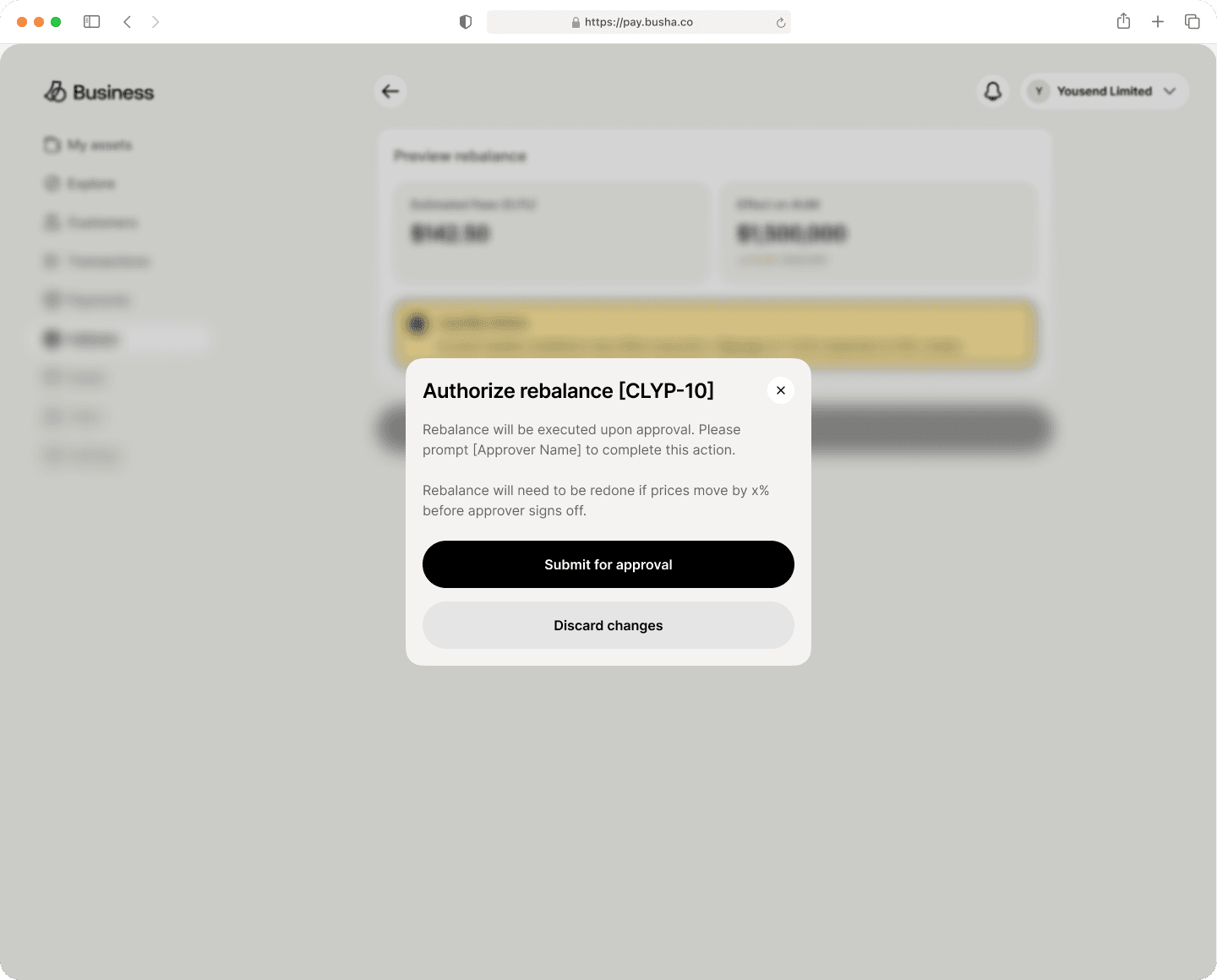
The last step is the part I’m most pleased with. Confirming a rebalance opens a dialog: the rebalance will execute upon approval, please prompt the named approver to complete this action.
Moving subscriber money on a licensed platform shouldn’t be one click by one person. Dual approval is standard practice in finance and largely absent from the software built for it. Naming the approver in the copy, instead of showing an abstract “pending approval” state, turns a system status into a social one. The manager knows who to go and talk to.
The second line of that dialog is the detail I’d point at in an interview. It warns that the rebalance will need redoing if prices move beyond a threshold before the approver signs off.
Approval takes time and markets don’t wait for it. Most dual-approval flows treat the thing being approved as static. This one isn’t: an approved trade based on stale prices is worse than no trade at all. Saying so upfront means the manager chases the sign-off with the right urgency instead of assuming the work is banked.
Warnings that change severity with proximity
A liquidity notice surfaces market conditions that will affect execution, naming the specific asset and the expected slippage. It appears in two places with two treatments: amber on the preview screen, where it’s context for a decision being made, and red on the index detail page, where it’s an alert about a position already held.
Same information, different urgency, because the user’s relationship to it differs in each place.
Implementation
Before engineering started I built clickable prototypes of each feature myself with AI-assisted tooling, so the three engineers could see the interactions instead of inferring them from static frames and a written spec.
That mattered most on the two screens where the design is entirely about what happens between states: the weights donut moving from 118% to 100%, and the Action column resolving as targets are typed. Neither survives a static frame. Handing over something you could click through removed a whole round of misinterpretation.
On the system side, this came shortly after a design system reconciliation I ran, which moved every Busha product onto a single parent system. Busha Business inherited those tokens instead of defining its own, so light and dark themes and the full component surface came effectively for free on a three-engineer team. That reconciliation is why a project this size was possible at that headcount.
Outcome
By February 2026 the beta had 84 businesses on it. Between them they created 139 indexes, drawing 65 subscribers.
I left shortly after that, so the launch and everything since belongs to the team that stayed. What I can say is that a product of this scope got built by three engineers in a quarter, went to real users, and shipped.
What I would do differently
The ratio in those numbers is the part I’d want to talk about. 139 products built, 65 subscriptions taken. More was made than was bought.
Some of that is what a closed beta looks like, where operators try a new tool without running a book on it. But I designed a creation tool, and creation is half of what an asset manager needs. Everything above is about building an index and keeping it aligned. Almost none of it is about the moment someone decides to subscribe, or how a manager gets in front of that person at all.
The Rules step has one checkbox for listing on Busha and another for third-party API access, and that’s the entire distribution surface in a product whose whole premise is distribution. Given the quarter again, I’d spend less of it on the sophistication of the creation flow and more on what happens after Submit for verification: what a subscriber sees, how a manager reaches them, what makes one index out of 139 the one somebody buys.